常见用法
使用方式和button类似 但是对现实内容进行了进一步扩充
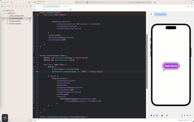
struct ContentView: View {
    @State var buttonStr:String = "Hello World"
    @State var buttonTaped = false

    var body: some View {
        Button {
            buttonTaped = !buttonTaped
            buttonStr = buttonTaped  ?  "你好" : "Hello World"

        } label: {
            //内嵌一个文本
            Text(buttonStr)
                .fontWeight(.bold)
                .font(.title)
                .padding()
                .background(Color.purple)
                .cornerRadius(40)
                .foregroundColor(.white)
                .padding(10)
                .overlay(
                    RoundedRectangle(cornerRadius: 40)
                        .stroke(Color.purple, lineWidth: 5)
                )
        }

    }
}
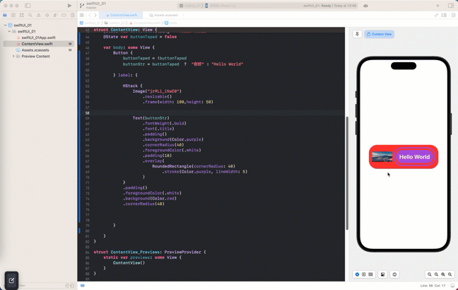
高级用法
内嵌组合视图
     Button {
            buttonTaped = !buttonTaped
            buttonStr = buttonTaped  ?  "你好" : "Hello World"

        } label: {

            HStack {
                Image("jr9Li_iNaE0")
                    .resizable()
                    .frame(width: 100,height: 50)


                Text(buttonStr)
                    .fontWeight(.bold)
                    .font(.title)
                    .padding()
                    .background(Color.purple)
                    .cornerRadius(40)
                    .foregroundColor(.white)
                    .padding(10)
                    .overlay(
                        RoundedRectangle(cornerRadius: 40)
                            .stroke(Color.purple, lineWidth: 5)
                    )
            }
            .padding()
            .foregroundColor(.white)
            .background(Color.red)

            //渐变色背景
            // .background(LinearGradient(gradient: Gradient(colors: [Color.red, Color.blue]), startPoint: .leading, endPoint: .trailing))

            .cornerRadius(40)


        }

    }
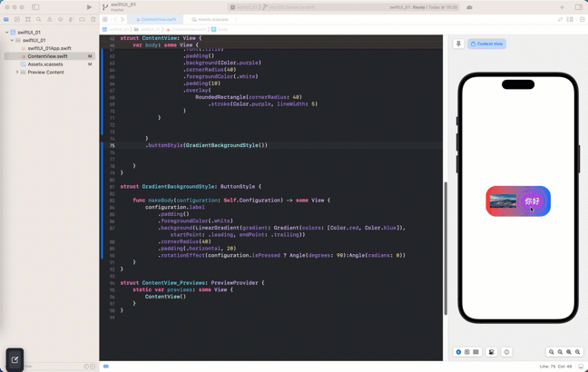
ButtonStyle 协议 抽离复用样式
SwiftUI 提供了 ButtonStyle 协议,可以抽离可复用的按钮样式
struct GradientBackgroundStyle: ButtonStyle {

    func makeBody(configuration: Self.Configuration) -> some View {
        configuration.label
            .padding()
            .foregroundColor(.white)
            .background(LinearGradient(gradient: Gradient(colors: [Color.red, Color.blue]), startPoint: .leading, endPoint: .trailing))
            .cornerRadius(40)
            .padding(.horizontal, 20)
    }
}


struct ContentView: View {
    @State var buttonStr:String = "Hello World"
    @State var buttonTaped = false

    var body: some View {
        Button {
            buttonTaped = !buttonTaped
            buttonStr = buttonTaped  ?  "你好" : "Hello World"

        } label: {

            HStack {
                Image("jr9Li_iNaE0")
                    .resizable()
                    .frame(width: 100,height: 50)


                Text(buttonStr)
                    .fontWeight(.bold)
                    .font(.title)
                    .padding()
                    .background(Color.purple)
                    .cornerRadius(40)
                    .foregroundColor(.white)
                    .padding(10)
                    .overlay(
                        RoundedRectangle(cornerRadius: 40)
                            .stroke(Color.purple, lineWidth: 5)
                    )
            }


        }
        .buttonStyle(GradientBackgroundStyle())


    }
}
configuration.isPressed 判断当前按钮是否按下
struct GradientBackgroundStyle: ButtonStyle {

    func makeBody(configuration: Self.Configuration) -> some View {
        configuration.label
            .padding()
            .foregroundColor(.white)
            .background(LinearGradient(gradient: Gradient(colors: [Color.red, Color.blue]), startPoint: .leading, endPoint: .trailing))
            .cornerRadius(40)
            .padding(.horizontal, 20)
            .rotationEffect(configuration.isPressed ? Angle(degrees: 90):Angle(radians: 0))
    }
}
效果如下:
常见属性
//渲染颜色
.tint(.purple)
// 按钮样式 系统样式 :.bordered、.borderless 和 .plain
.buttonStyle(.bordered)
//按钮边框样式
.buttonBorderShape(.capsule)
//按钮预设大小
.controlSize(.large)
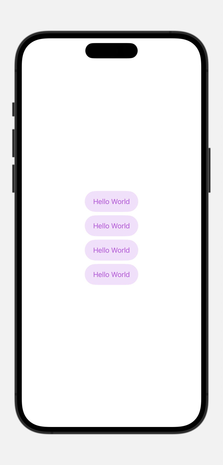
渲染多个按钮
VStack{
            Button {
                self.buttonTaped.toggle()

            } label: {
                  Text(buttonTaped  ?  "你好" : "Hello World")
            }
            Button {
                self.buttonTaped.toggle()

            } label: {
                  Text(buttonTaped  ?  "你好" : "Hello World")
            }
            Button {
                self.buttonTaped.toggle()

            } label: {
                  Text(buttonTaped  ?  "你好" : "Hello World")
            }
            Button {
                self.buttonTaped.toggle()

            } label: {
                  Text(buttonTaped  ?  "你好" : "Hello World")
            }
        }
        //渲染颜色
        .tint(.purple)
        // 按钮样式 系统样式 :.bordered、.borderless 和 .plain
        .buttonStyle(.bordered)
        //按钮边框样式
        .buttonBorderShape(.capsule)
        //按钮预设大小
        .controlSize(.large)